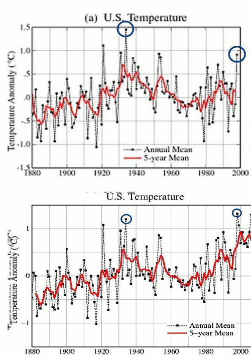
If government employees are going to alter data to reverse measured cooling trends into warming trends, it is absolutely essential that each and every graph is clearly marked as altered. Otherwise, people might accidentally confuse it as being legitimate.
And if you point out that they have altered the data, they use their government funded salaries to publicly say that your analysis is faulty. These aren’t my graphs. They are NASA graphs. It isn’t my analysis, it is NASA’s analysis.
Obviously we should just blindly accept everything government employees say.


…”it is absolutely essential that each and every graph is clearly marked as altered. Otherwise, people might accidentally confuse it as being legitimate…
Oh yes, here lies a problem.
If it’s any consolation the changed graph does make 1990 hotter.
Andy
I just posted this over at WUWT.
As I write this. Steven Godard has at the top item on his blog a simple animation which flashes between two graphs which have been overlaid. The graphs are allegedly from the same Government organisation and illustrate the same data. They show temperature changes since 1880 and they have been substantially altered between earlier and later versions with the later graph showing a steeper warming trend.
Now there are only three possible explanations for this.
1. Steve Goddard has faked these graphs.
2. The graphs are real and they are evidence of scientific malpractice…or
3. These graphs are real but the alterations are justifiable.
Now this isn’t quantum physics, there is no uncertainty principle, there is no cat in a box waiting to find out if it’s dead or alive, there’s no hedging and no fudge.
This is real straight forward science.
1. 2. or 3. ?
Not just a steeper warming trend; a reversed warming trend. The graphs show what was originally a cooling trend is now a warming trend.
“Objects in NASA graphs may appear warmer than they are.”
Good one! My first chuckle of the day.
Exactly.
At BEST they at least show individual raw data.
What I find most curious is they also show the difference between raw and “regional”. Using my region as an example, every individual record shows the same double peak (30’s and 90’s) and cooling to the present. However, the “regional” shows the typical hockeystick! So they then manipulate each individual record to match the regional hockeystick!