

Disrupting the Borg is expensive and time consuming!

Recent Comments
saveenergy on Cattle And The Climate gelcarrion0t on New Video : Analyzing Oil And… saveenergy on Is Antarctica Melting? saveenergy on 65 Years Of Progress! Jeff L. on Analyzing The Western Water Cr… Morgan Wright on Great Lakes Approaching 100% I… Morgan Wright on Great Lakes Set Another Spring… gelcarrion0t on New Visitech Features saveenergy on Ice-Free Arctic By 2014 gelcarrion0t on Ice-Free Arctic By 2014


How can we be sure the satellites aren’t just mistaking poley bear carcasses for ice?
Area is also tracking in the same direction.
Steve has done a great job this summer, handling all the alarmist true believers that have doubted him every step of the way.
I hope you don’t mean me in one of those alarmists. I would rather not think of Steve handling me, it conjurs up images of airport security and my sacks being sqeezed!
😀
Andy
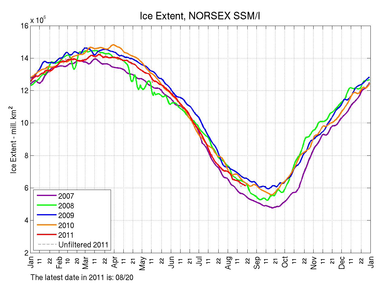
The Arctic Roos graph always puzzles me. It always seeme to give a funny value compared to all the other graphs and also if you look at 2008 above why is it so squiggly? Compare it to 2008 on these graphs
http://ocean.dmi.dk/arctic/icecover.uk.php
http://www.ijis.iarc.uaf.edu/en/home/seaice_extent.htm
2008 is pretty smooth.