
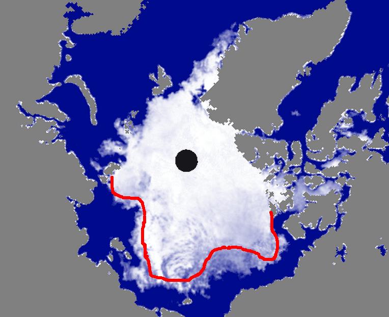
The red line represents the minimum amount of loss likely over the next month. It could melt back further than that, but probably not less.
The red line represents the minimum amount of loss likely over the next month. It could melt back further than that, but probably not less.


 | saveenergy on Cattle And The Climate |
 | gelcarrion0t on New Video : Analyzing Oil And… |
| saveenergy on Is Antarctica Melting? |
| saveenergy on 65 Years Of Progress! |
 | Jeff L. on Analyzing The Western Water Cr… |
 | Morgan Wright on Great Lakes Approaching 100% I… |
| Morgan Wright on Great Lakes Set Another Spring… |
| gelcarrion0t on New Visitech Features |
| saveenergy on Ice-Free Arctic By 2014 |
| gelcarrion0t on Ice-Free Arctic By 2014 |
I assume that line was only drawn wrt the Alaskan side. Presumably, we can expect some losses in the Greenland Sea, for instance. I think it’d be interesting if the Greenland Sea ice remained, however, and I’d be curious as to the implications of having a stronger ice pack there this winter and how it affects flow out of the Fram Strait.
-Scott
Greenland Sea ice is all doomed ice and not really important.