
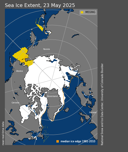
NSIDC maps currently show more area of above normal extent than below normal.
")
So why is their graph headed the wrong direction?

NSIDC maps currently show more area of above normal extent than below normal.
So why is their graph headed the wrong direction?

| saveenergy on Cattle And The Climate | |
| gelcarrion0t on New Video : Analyzing Oil And… | |
| saveenergy on Is Antarctica Melting? | |
| saveenergy on 65 Years Of Progress! | |
| Jeff L. on Analyzing The Western Water Cr… | |
| Morgan Wright on Great Lakes Approaching 100% I… | |
| Morgan Wright on Great Lakes Set Another Spring… | |
| gelcarrion0t on New Visitech Features | |
| saveenergy on Ice-Free Arctic By 2014 | |
| gelcarrion0t on Ice-Free Arctic By 2014 |
I was just there before coming here and I find you with the same conundrum.
Oh! and dare I say it? Cairngorm mountain ski season continues apace with the “walk at the top ” still cancelled for the foreseeable future due to adverse wintry conditions.
Not a lot of people know that…………. Or that!
They prolly just changed the way they figured it again…….
As the question again and you might get a 2000-word explanation.
I gave a possible explanation before: weren’t you listening? Maybe it’ll stick if you work the figures out yourself. Consider 10 pixels on or around the ice border for any given day of the year. Percentage ice values for each pixel across a 10-year period are as follows:
A: 14, 61, 12, 10, 6, 0, 15, 8, 43, 22
B: 21, 33, 18, 0, 32, 20, 3, 9, 15, 25
C: 9, 22, 0, 17, 12, 2, 68, 42, 32, 6
D: 18, 13, 20, 7, 16, 8, 22, 0, 28, 11
E: 11, 9, 10, 14, 18, 14, 19, 25, 63, 0
F: 62, 18, 3, 4, 31, 26, 0, 11, 22, 10,
G: 23, 33, 14, 27, 0, 6, 9, 71, 12, 42
H: 16, 57, 33, 16, 22, 12, 11, 9, 0, 3
I: 0, 21, 27, 16, 11, 18, 34, 2, 6, 13,
J: 17, 0, 12, 11, 3, 19, 45, 33, 32, 6
First, please calculate the extent for each year (i.e. going down each column, see how many pixels are >15%), and then average them.
Second, take the median for each pixel across the 10-year period (i.e. median of each row) and then see how many of those are >15%
The map shows only >15%
I know it does. Please do the calculations I asked you to do in order to demonstrate why the sequence of operations is important.
I think you may be trying to factor in a precision calculation which has already been accounted for by the time the maps are produced.
Answers here:
Extent for each year = 6, 7, 4, 4 ,5 ,4, 6, 4, 7, 3
Average extent = 5
Median extent for each pixel:
A: 13
B: 19
C: 14.5
D: 14.5
E: 14
F: 14.5
G: 18.5
H: 14
I: 14.5
J: 14.5
Average median extent across all pixels = 2
Simply put, the wiggly outline on the map does not show the same values as the climatology line on the line graph, because the operations are performed in a different order.
For pixels near the ice edge, then some of them will just squeak above the concentration threshold each year, and thus be counted in the yearly extents which are then averaged together to give the climatology values on the line graph. When you take the median values on a per-pixel basis, these pixels fall under the threshold and are not counted.
Thus, the wiggly line on the map will enclose a lower area than the climatology values on the line graph.
How about this official US Government graph of sea ice extent:
http://www.globalchange.gov/HighResImages/2-National-pg-39_left.jpg
Try the same graph with the y-axis starting at zero.
NSIDC scientists realize they must toe the official government line warning of declining arctic sea ice. We’ll probably never see the ice extent rise above the 1979-2000 average on the NSIDC graphical plot. NSIDC will find a way to keep the ice extent on message, i.e. melting as a result of human-induced CO2 in the atmosphere.
Many climate scientists — in government and academia — understand all too clearly that to challenge the AGW talking points publicly is career suicide.
Agreed. It will be well beyond the late 1970s extent before they will have real difficulty hiding it.
those maps are really off if you look at bottom its showing ice in the st-lawrence next to new-brunswick and nova scotia , in late june lol pretty positive there is nothing there since like 2 months ago