
I superimposed Muller’s temperature graph of recent warming on the Vostok graph. Can you find it?

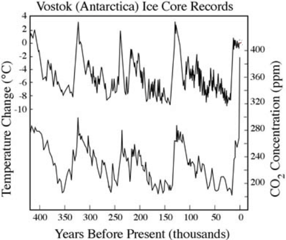
You can see the extreme climate sensitivity!
ROFLMAO
I superimposed Muller’s temperature graph of recent warming on the Vostok graph. Can you find it?
You can see the extreme climate sensitivity!
ROFLMAO


 | saveenergy on Cattle And The Climate |
 | gelcarrion0t on New Video : Analyzing Oil And… |
| saveenergy on Is Antarctica Melting? |
| saveenergy on 65 Years Of Progress! |
 | Jeff L. on Analyzing The Western Water Cr… |
 | Morgan Wright on Great Lakes Approaching 100% I… |
| Morgan Wright on Great Lakes Set Another Spring… |
| gelcarrion0t on New Visitech Features |
| saveenergy on Ice-Free Arctic By 2014 |
| gelcarrion0t on Ice-Free Arctic By 2014 |
It’s red, it’s blinding……….
MY EYES
(ok, this really is funny. Someone needs to send it to Muller and Congress)
I thought it was dirt on my monitor and rubbed it with my finger, seriously!
I wonder why no warmist is making the relatively simple point that CO2 concentrations might have levelled off temperatures that on past performance would have been plummeting by now? (Answer: because it could be interpreted as a positive effect of CO2 emissions, thereby preventing the wholesale societal changes the warmists keep advocating)
Not that I necessarily believe that myself, but a comparison between the most recent part of the graph and past spikes could be thus interpreted. Has anybody tried to measure the “kurtosis” of each peak (I know, it’s not the right word)